MS Teams PWA
Posted on 2022-11-21 in misc • 6 min read
Introduction
It's apparently official, the Teams progressive web app is now available. There is nothing particularly magic about this "release", so everything I have already bitched about is still going to be that same suck fest. But now there will be even new ways to suck, as it will be limited to what integration a browser can do.
I'm generally a fan of things just being a web page. I have a browser open 100% of the time anyway, so what do I need a dedicated app for? There are some trade-offs, and of course Teams manages to make the worst use of all of them. Let's dive into what makes this new MS Teams offering suck in new ways.
Installation
I first did the unholy thing of installing microsoft-edge on my Fedora 37 computer (I'm sorry). This should work on Chrome/Chromium, but it absolutely will not work with Firefox, which is super annoying because I do everything I can to keep Chrome-y stuff off my laptop. But here we are, I'm left with basically no choice.
"Installation" is a bit of a misnomer with PWA's, as it is essentially just a bookmark to the website. So I went to teams.microsoft.com. There is an icon in the upper-right hand side that identifies a PWA is available, and you can click that. That will create a ".desktop" file somewhere, I have no idea where, that will let you run teams from your app launcher like a regular app.
Since I am now just using a web page, there will be even fewer (than the already basically zero) indications when something is updated with the app.
New Annoyances
Border
Right off the bat, there is a super-annoying visual thing. For some reason, when edge is serving as an app, it has an annoying blue border around the app. If you are just in teams.microsoft.com in edge (not in a PWA) it doesn't have that border.
Here, have some border
I'm sure there are some who are not bothered by this. I am currently using i3wm, and do my best to maximize space. Yes, it's just a border, but it is space that is wasted, and just looks ugly to me. It doesn't match any other window decorations, and I hate it.
Links
I prefer Firefox, and is (when I can help it) the only browser I use. When using the previous crappy app, clicking a link would end up using your default browser. With the progressive web app running in Edge, any link I open in a chat will open in a tab within Edge. This is first of all just not my preference, but aside from that, any sessions, or passwords I have saved in Firefox don't matter, and now I have duplicated efforts. I am sure-as-hell not letting Edge manage my passwords :)
Note
Technically I'm using LastPass for password management, so there is no reason that I can't install that for Edge too, but it still is a minor annoyance because I'm already logged into LastPass in Firefox, so I have an additional login step for Edge/Teams. The same is true for any ad blocking or any preference-enhancing plugins. I now have to do that twice to get the same experience, or just suffer through whatever shit experience I get on Edge.
Tray Icon
There is no Teams icon in the system tray. This doesn't probably matter for me, because I have teams bound to a particular workspace, so I can't click on the tray icon and do anything meaningful anyway, but this might be an extra annoyance for some. It's weird to not see it there, but I guess I'm kind of <meh> on that. It can also be helpful to see an annoying red dot showing that you have unread messages, that without it you have to explicitly go to the app for.
Screen sharing
It appears it takes 4 clicks to share a screen in this version (previously, I think it was 2). Once you do that there is this fucking notification that despite the button inviting you to hide it, you cannot turn it off. It also shows up on your screen share, so if there is text under it, the fucking thing has to be moved around so remote people can see it. In the dedicated app, when you were sharing a screen, you would get a red border around the screen to show you were sharing. I know I complained about the blue border above, but that serves no purpose. The red border serves a purpose and is my preference over this shit:

Please just make hide work FFS
Losing Audio
In the first meeting I was in (which I got no notification for when it started) I was "happily" participating. At some point in the meeting my microphone stopped working. The only thing I did was mute/unmute my mic with the button on my laptop (not the teams in-app button). It seems that confused Teams.
Your microphone is muted
I have a global shortcut to silence my microphone at the pipewire layer. This is exactly the same as hitting the "FN+F8" on my laptop. This allows me to be in a team meeting in one desktop, working on another, and easily hit the key combo to mute it. I happened to map the "Siri/cortana" button (since it's a microphone) on my Keychron K8 pro so I have a single button mute/unmute. Anyway, the teams web app keeps track of that, and can tell when it is silenced, so it pops up this notification
That one is a little annoying, but it sticks within the chat window, so it's not that big of a deal.
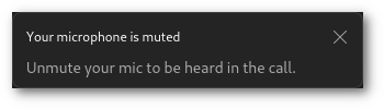
Teams insists on running within a single window, so when you click out of your active meeting, it squishes the active speaker into a little window. Well, when you are in "little meeting" mode, the entire fucking window is taken up by the stupid, obnoxious notification that the microphone is muted:
Notifications
This seems to be just using the browser notifications, which is fine. There is no "[Join]" button, but I'm happier to get a notification that takes me to the app to join, since the app version didn't always span to whatever active desktop I was on. So that means an alert goes to my notification handler (dunst) and should just work. For some reason, it seems that after some period of time, I just won't get notifications. It's not something I have been able to pin-point yet, but I can start off in the morning seeing notifications. Go for a while, notice I haven't seen any notifications, click over to the app and see chats waiting. I do have some channels silenced, but that's not what's going on here. I have personal chats that come in that I miss because there is no notification that fired.
Additionally (and is kind of called out in the announcement), meeting notifications don't seem to come through. On the announcement it says "system notifications for chat and channel", and I think it literally means just those two things.
App Identification
Even though this is "Installed" as a PWA, as far as the OS is concerned the window classes are all "Micrsosoft-edge". First, it annoys me that they prefix everything with their stupid name, but functionally, that means that I cannot have rules for things like "Teams" notifications be handled differently than edge browser notifications, becuase to Xwindows, they are all just "Microsoft-edge". I am never going to use Edge for anything other than teams, so the end result is going to end up the same, but really, there should be some way to differentiate Teams/PWA/App window from plain old stupid edge.
Bonus Edge Annoyance
This isn't really a teams thing, since it is a setting in Edge, but this aggrevates me (probably more than it should):
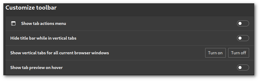
one of these things is not like the other
Turning something on and off, as represented by toggle switches. Pretty normal stuff. But why in the hell does the vertical tabs setting have two distinct "off" and "on" buttons instead of a toggle like literally everything else on the settings?
Summary
I have only used the PWA version of the web app for a couple days. All of these annoyances showed up nearly immediately. I'm sure there will be a long list of more annoyances to come.