MS Teams Rant
Posted on 2022-10-14 in misc • 46 min read
Note
I originally wrote this on 2021-03-11. I have kept this up-to-date with my various gripes and frustrations (and even the few things that have been fixed) as I come across them.
Introduction
I have used instant messaging programs essentially since the world wide web began. I have used IRC, ICQ, XMPP (various clients), Pidgin (for access to various protocols), Slack, Discord, Telegram, Matrix, and many others. I think I have a wealth of professional (and hobby) experience with chat protocols and clients to know when one isn't all that good. And while I am admittedly pretty biased against all things Microsoft, in my professional and personal opinion, Microsoft Teams sucks!
I say this a lot, and people ask me "what about it sucks" and I say something vague like "damn near everything". While that is being a little obtuse, there is a great deal about it I don't like and I'm going to try to outline each of them in this post. Of course some of it is just personal preference, and I will try to call out things that are just me being picky about it not working the way I want. So grab a comfy chair and a snack, this could take a while.
Most of what follows is a comparison between MS Teams and Slack, because Slack is the tool that I am most familiar with, the one I feel has some of the best interaction, and the one that people (Discord for example) seem to copy the most :).
I have been adding and editing these annoyances as things change, so this rant is kept up-to-date.
My Environment
I am on Linux (specifically Fedora 33 34 35 36) for my desktop chat, and an iPhone8 (running ios 14 15) for mobile. I have never used the Windows client, though I believe the app is based on electron, which should mean the experience is pretty universal; However, there are features that are just missing from the Linux version. I am not going to highlight that specifically, because it is mostly pointless things like the background blur, background images or the really weird thing where everyone shows up in a virtual auditorium. And also, except for the few things that others have mentioned, or that I can see because of remote settings, I would have no idea what else I'm missing :)
What doesn't suck about it?
First of all, at its core I can instant message people, they get a notification (probably) and can respond. It shows presence (kind of) so they know when I'm available and whether or not to expect a reply rapidly. There is heavy integration with other MS services, which personally I feel just junks up the app and makes it more bloated for a bunch of features that are not core to messaging. That is a personal opinion though, and others would certainly disagree. One thing that integration gets is calendar awareness. You can view your calendar (complete with [Join] buttons for meetings associated with teams) and it will show time as "busy" when a meeting is scheduled.
The video/voice/screensharing portion is not too bad, and is pretty much on-par with everyone else (Zoom, BigBlueButton, Jitsi, etc.) in the space. Nothing in particular stands out as a specific Teams thing that sucks here, they just all kind of have the same basic level of less-than-optimal-awkwardness, but overall not too bad. Since I am using the free version of Slack, I don't have video conferencing/voice chat capability at all to compare it to directly in Slack.
Size
Microsoft is often known for "bloat", and things just taking up resources more than they should. Teams is no different. It is nearly double the resources of slack on my desktop and mobile.
Install Size
The install size of Teams on my computer is 271MB. It's not huge, BUT it is nearly 1/3 bigger than either Slack (which is 184MB) or Discord (which is 167MB). Both of which are doing pretty much the same thing and all are based on Electron.
On my phone, the app itself is 212.5MB for Teams and 136.7MB for Slack. When "Documents & Data" space is factored in, which is basically the cache, Teams takes up 587.8MB ~1GB! Slack is only 148MB and provides a method for "resetting" the cache, which Teams does not have an option. I use Slack far more often than Teams. I don't know if Slack is doing some management on it's own or what, but Teams is clearly just letting cache build forever. The only way to get rid of that wasted space is to delete and reinstall the app. This is a common issue with apps on iOS, and not unique to Teams. There are also apps that deal with this appropriately where Teams falls into the former group.
Update 2021-08-03: The teams app on my phone, which I barely even use is now taking up 1.06GB of storage from it's 220(ish)MB install size. At some point they added a "Data and storage" section in settings with links to "Clear downloaded files" and "Clear app storage". Clicking them displays a very quick "Done!" message but the size reported in settings for the app is never altered. I removed the app and reinstalled it again and got it back down to 230MB, but it will keep growing.

"Why you so big?" - John Pinette
Running Size
Currently, my Teams application is taking 521MB of RAM. This is resident memory. Compared to my current Slack utilization which is at 258MB. So as usual, pretty much double the usage. The CPU and Memory utilization shoot up considerably when on a video call. I get that video encoding/decoding takes more CPU, its just that it uses WAY more resources than anything else in the same space. When I am in a meeting, glances reports that teams is using between 120%-140% CPU.
UI/UX
The general layout it is "OK". The tool bar on the left has things like "Activity", "Chat", "Teams", "Assignments", "Calendar", "Calls", and "Files".
Things get weird when comparing "chat" and "teams" for example. They look the same, but Teams (The messaging space, not the app) is NOT a chat. The messages on what looks like a team chat are actually called "posts", and they behave differently. They are threaded (which I don't personally care for, but some people like it), and it annoyingly does not show a whole post if it is too big forcing the user to click a more button to actually read the full post.
Throughout the interface, so many mouse interactions are required. One of the things Slack, in particular, does really well is to have keyboard commands for nearly everything. This is important in a chat app, because chatting requires your hands to be on the keyboard. If you are constantly changing contexts between mouse and keyboard, it slows down the overall action and it just becomes more cumbersome to work with it.
Typing...
(added 2021-09-09)
This is nitpicky and stupid, I admit that right up front. Almost every chat application these days have a typing notification that is generally some variation of three dots in some kind of motion. They normally follow some progression like the fading in and out of dots of imessage

or an imessage-like bubble with bouncing dots

or perhaps just bouncing dots:

And then there's teams:

Just as a general UI/UX thing, I find the seemingly-random squishing of the dots annoying and I really wish it was just "normal" and followed a progression. Maybe it's supposed to simulate the sort-of random-looking hitting of keys on a keyboard. I have no idea, but nearly every wait notification follows some predictable pattern, and these just look random. Each dot is squishing at it's own speed unrelated to the others. As I said, this is just a nitpicky, stupid thing that has no real bearing on the app. In the general look&feel of the app, this doesn't help it in my opinion.
Random Blank lines (2021-11-16)
If you click the gif button to add an image, the image pops into your text box and the cursor is placed underneath the image. So far so good, but wait! I'm not sure that image really works, I'll just remove that by hitting backspace and type out my response instead. Now at this point, the cursor is at the upper-leftmost position in the text box (expected), but for some reason there is now an empty line under it? Why? Where did that come from?
If you have an image, and you go to the next line, you essentially have <img><newline>. I would expect to hit backspace twice, once to remove the newline, then to remove the image. Of course it's possible for that to somehow be smart enough to like "undo" the <img><newline> so it only does it in one step. Either of those would be expected. Backspacing over that and being left with an extra line is not expected. So if you wanted to get back to "nothing" you actually have to <BS><DEL> because it added this random line in front of the cursor. It makes no sense.
Cramming words after @mentions (2022-02-09)
If you @mention someone you type the at symbol, and start typing out the person's name. It will start to autocomplete and if you hit enter, it will fill out the user's name. Normal enough. But here's the annoying catch. It will put User Name and put the cursor immediately after the 'e' in this case. So if you start typing it ends up being User Namedid you check on that thing. Every other platform I have used either represents that username as a little button kind of icon, or puts a space after it on its own (slack). It does something to separate the username from the actual text you are typing. With Teams, you have to know that it's stupid and put the space in there yourself, otherwise whatever you are typing is all jumbled together. As usual, it's a very minor thing, but it's stupid and shouldn't work that way.
Auto-numbering is weird (2022-02-10)
If you try to enter a numbered list in the chat, it doesn't work on its own. If you type a message, hit shift-enter (because enter will send the message) to go to the next line and start with 1., it will recognize you are going a numbered list and indent that line which is what all MS products do when it recognizes you are going to type an ordered list. So far so good. I type my item, hit shift-enter to go to the next line where I expect it to give me 2. since it clearly recognized I was typing a numbered list right? WRONG! It indents the line like it knows it was supposed to do something with it, but it won't actually add another number. Now I'm left with extra spaces that if I try to delete, will just put me back to the end of my first line. And hitting enter to advance to the next list item doesn't work because it will send the message.
The fix is to hit the "formatting" button to go into the multi-line editor which enter will advance to the next line (incrementing the number in a list) but not send the message. You then have to hit ctrl-enter or hit the "send", paper airplane looking button.
It can be argued that it's technically doing the right thing, but just in a sort of confusing way. When in a numbered list, typically shift-enter goes to the next line without advancing the number. However, since it automatically added the number, it should be smart enough to force me into the multi-line editor or to accept shift-enter to advance the number. Personally I would rather it just not attempt to format it as a numbered list and just let me manage it or force me to hit the formatting button if I want to do autonumbering. To me, offering up a numbered list and giving me no obvious way to actually advance the number without knowing that I have to into another editor mode isn't helpful.
To compare with Slack: shift-enter does actually advance the number. It behaves just like enter typically does in a list. Hitting shift-enter once takes me to the next number, if I don't type anything and hit shift-enter again, it will delete the number and just put me on the next line. This is the most predictable behavior to me. Similarly, if I use ``` to start a code block, slack will automatically disable enter sending the message and forces me to either hit ctrl-enter to send it, or (correctly) close the code block with ``` and hit enter.
Selecting Text (2021-11-29)
There are various points that selecting text is not ideal. One that I have stumbled upon is triple-clicking a message to copy the content doesn't work for just the content. The sender and time also get selected. These should be identified as header data, and not part of the message itself. This forces you to click and drag to select a message, which is slower and also a little frustrating on a touchpad (that's just the nature of touchpads, but is exacerbated by Teams sucking).
Black Text (2022-02-16)
Rich text formatting with copy and paste has always been a mixed bag on Windows platforms. Many times it does what you expect, but there are also a lot of times that it does things like pastes HTML-formatted email in a spreadsheet and you have to clean that up with format painter. In Teams, when you are using dark mode, and someone copies and pastes something you will very most likely get a completely unreadable black box. Instead of just pasting the text and letting the client side handle the coloring, it pasted in the formatting of "this is black text on the default background". Which makes it impossible to read without highlighting the text.
Broken code block (2022-02-18)
If you are attempting to share code with a team member through teams, it will be more work than it is worth. Teams's code block formatting strips leading whitespace. How is this even a thing? The whole point of a code block is that it is supposed to preserve the formatting of whatever you paste in there!
Here is a tiny little hello world python block. The indentation is critical in python because that is how blocks are defined and it "knows" that the print statement is part of the function definition.

Hello world in python with proper indentation.
Copying and pasting that code into teams yields this:
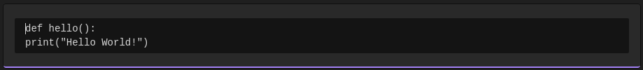
Invalid code because teams ate the leading whitespace
Assuming I had shared something more substantial, my teammate would have to go through and piece everything back together. In this case, if they ran the code as teams presented it, they would get python telling them "IndentationError: expected an indented block after function definition on line 1".
Further testing reveals that no matter how you paste in code to a chat, it will always remove leading whitespace. So I think the whole "enter code formatter with three backticks" thing isn't really entering a code formatter. Instead, it is just wrapping the same same broken-ass text editor as a normal chat with a black box to show that it is supposed to be code. It's a style, not an actual different object.
Zoom?
2022-07-13 I was in a meeting where someone was sharing their screen (pretty typical interaction). His text was a little small, and I wanted to try to make the content bigger. I was intially looking for a full screen view, but I clicked the three dots menu in the upper-right hand corner, and saw "Zoom". Thinking that would possibly do the job I clicked zoom. And all the participants and buttons for the chat got bigger, but the actual screen share SHRUNK. The "zoom" button zooms UI components, but not the shared screen. It seems pointless and unintuitive.
As a side note, I did find the show full screen in a different three dots menu, which did work the way I wanted eventually.
Chat
In all of the chat cases (teams' technically not chat...and the chat) the actual chat content takes up a ridiculously small portion of the screen. Just looking at the horizontal measurement (so it's actually a little less), the chat on a 1920px wide screen starts at 740 and ends at about 1540 leaving 800 px wide of actual chat. On a 1920px wide screen, that means 60% of the screen is taken up by things that aren't chat. A full 30% is just completely wasted, empty space. For a chatting app, it sure doesn't prioritize space for the actual chat.
This is a personal preference thing, but chats are displayed in a messages style interaction (commonly called bubbles), where other people's chats are left justified and my chats are right justified. It also highlights mine in blue. Again, it's a personal preference but I would rather it be more IRC style with all of them aligned the same way. I don't mind there being different colors, it just seems pointless to me to justify them that way. If I think more about it though, this "mobile chat"/"bubbles" view is probably the exact reason that 60% of the chat screen is wasted. If the full screen is used, and right/left justified the messages your eyes would have to track a lot of pixels to follow a conversation. There are no settings to change this behavior, and no way to override it with a theme change.
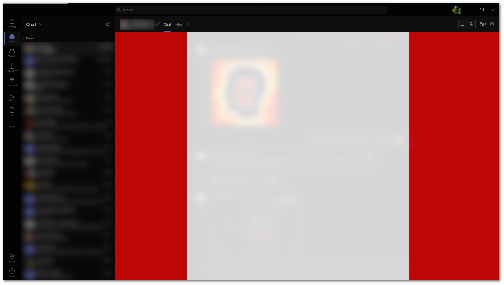
This image is my chat maximized, the tiny little white area is all that is given for the chat. The Red area is completely wasted, always-blank space.
Using the same horizontal metric, Slack utilizes 85% of the screen for chat, only missing 280px on the left for the channel listing and leaving 1640px for the chat content. You can also drag the border to resize the channel area in Slack. Apart from the minimal amount of space around objects, there is no completely wasted space in the slack interface.
The white area is the space dedicated to chat for Slack
In Slack, you also have some additional settings to tweak the layout to make the most use of the already-ample space used. These include how to display names, and a "Compact" or "Clean" message style. There is no way to customize the message style in Teams.
Update (2022-03-01)
At long last, there is an option remove the stupid, ugly-ass, space-wasting chat bubble interface. In settings there is a "Chat Density" section.
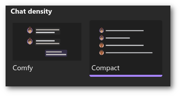
The layout that it gives puts everything on a single, full-pane-width line. The new problem is there is no good separation between the person's name and the chat. The name is bolded, but it kind of all runs together. In slack, matrix, and discord (probably everyone else) they are separated by a line. I think the single line could still work, but I would prefer the names be represented as a pill maybe, to more obviously separate the person from the text. But this is still an improvement and is now how my chat is configured.
Channel Linking
In Slack if I'm in the #general channel, and I want to tell my teammates to check out that message in #alerts. I can do just that. The #alerts will be a link to the #alerts channel and they can click on it and easily reference the alert I'm talking about. In Teams, you have to navigate to where you want to link the person to (leaving your chat) right-click/click the "..." button, select "get link to channel", then click copy (or ctrl-c), then go back to your original chat and paste in a roughly 200 character URL. It is a shit experience when Slack's #channel reference takes zero effort.
If you don't have anything useful to say, don't say anything at all
(added 2021-09-24)
When people are out of the office, and they are in a chat, Teams will "helpfully" tell you that they are out of office and may not respond. This is kind of helpful, but becomes annoying because every time you come back to the chat it will keep reminding you. You can click the X to close it, and it will stay closed unless you navigate to another chat. It would be nice if this was a daily thing or something instead of reminding you every time.
In true Teams fashion, there is a further annoyance though. If there are more than 3 people out at the same time, you get this:

3 or more people are out, but I'm not going to give you any idea who or actually how many
So the nearly useful feature is rendered useless if there are 3 or more people out. Teams will only tell you that "3 or more people" are out. There is no other way to see the status. You can't click the banner to get more information. If you click on the contact list, it will show their online status, but not their out of office status that triggered the notification in the first place.
Teams - The channel type, not the app
I keep specifying "Teams, the channel not the app" to note that I am specifically talking about one particular area of the Teams app. This is another kind of general pet peeve of mine with Microsoft: the naming of things often causes confusion in itself. They choose kind of generic names (word, teams, access) and without specifically calling things out is can be confusing if I am talking about "a word" or "word, the Microsoft word processing app". Same goes for "Teams the application" vs. "Teams the channel".

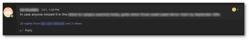
Tangled Threads (2021-07-30)
As mentioned briefly in the UI/UX section, Chats in a Team are not chats, but "Posts" and they behave differently than a chat. They are threaded, in that each post can have replies tied to it. Each Thread shows up as what looks like a chat, but with an "X number of replies from..." link at the bottom. You have to click that link to show the threads.
Yay! More clicking
If there are a lot of "posts" in the thread, you will additionally have to click a "See previous replies" because teams will show the most recent ones. If you are active in multiple threads it gets even worse since you have to jump back and forth (potentially collapsing and expanding the posts). It is extremely cumbersome, and is a very awkward interface. There is just so much clicking and scrolling to piece together the messages in a "post".
(Updated 2021-08-11) The more I use Teams channels, the more I hate every single interaction with them. The "threading" is absolutely brain dead. There is basically no indication that a thread has new information (except for the 'x replies from...' incrementing the 'x') until someone realizes that I haven't respond and they @mention me. Then only that @mention text displays uncollapsed, out of order of the rest of the thread. You have to expand the thread to see why you were @mentioned, and that tiny-ass little 'x replies from...' is not obvious. Then most of the time I have to click through a couple "show more" links to see the part where it matters.
In general, I am not a fan of threaded discussions. I understand the logic in having them. In public spaces, it does make sense that there are multiple conversations and threading logically makes sense. I haven't seen a threaded conversation interface in a chat that makes it very pleasant though. Slack doesn't do too bad, a thread is broken up in a frame to the right of the chat. This is decent, but only handles one thread. I think this is a better start, but still not ideal. I have never seen a worse, more convoluted, click-driven interface than that of teams threading though.
If you happen to like threads in your conversations, tough luck. You only get them in teams channels. Group chat and individual chats do not offer threading. Slack, on the other hand, supports threads in all conversation types.
Teams/Thread notifications (2021-08-12)
As if threads weren't already painful enough to deal with, the notifications are equally stupid. When someone responds to a post, there is just a generic "<username> has responded to a conversation you are in" message. Then it is up to you to click through "activity" and hunt it down through the shitty list of posts. And probably have to click a "x replies from..." and "show more" links for good measure.
Teams and Sharepoint
Being a Linux person, I don't fully understand what "SharePoint" exactly means. Teams does back a lot of its operations to SharePoint (like files which ultimately are SharePoint objects). You may also integrate things into your team space. Some may think this is a bonus, but to me, teams-as-a-sharepoint-object ends up being a half-assed embedding of an already half-assed web version (1/4 assed?) of whatever tool is embedded. And as a result they are S......L......O......W. It's possible to embed a OneNote notebook in a Team space as a "Tab". There is, of course, no way to link to this; someone can tell you "It's in the OneNote tab in our team" and then you just have to navigate there.
While I'm trying to demonstrate the painful slowness of these interactions for my rant, they are all taking between 5-8 seconds to load. Which is a little slow, but not the kind of slowness I am actually complaining about.
2022-07-13: Files that are shared in chat, aren't actually files shared in chat. They are files that are uploaded to sharepoint files, and then that sharepoint link is shared in chat. It's typically not much different in practice, unless you happen to share a file by the same name. Then it will annoyingly bring up a confirmation that "A file by this name already exists".
Sharing a file (2021-07-29)
A colleague of mine recently shared a file to me in a teams chat. We were working on signing a certificate with our CA. He sent me the CSR, which is just a simple text file. I get this notification in teams:
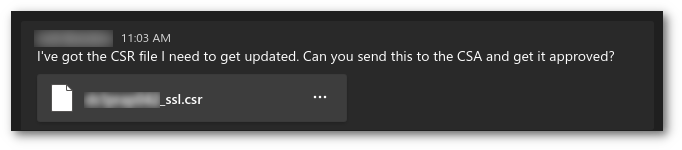
"Normal" file share message in teams. Nothing too aggravating about that. "But wait, there's more"
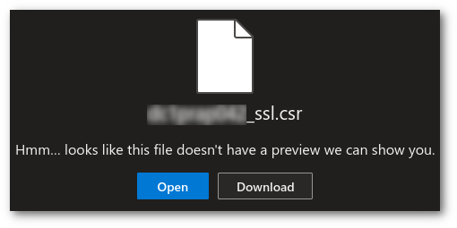
So I click the 3 dots menu to get the file contents and am presented with the following:

Ok, slightly annoying but nothing maddening yet.
I see the "open in browser" option. I think "ok, it's just a text file that I need to copy and paste to the CA, no problem, let's do that. Clicking that (or the URL that is given in the "copy url" option) doesn't just open that file in the browser. That takes you to the sharepoint object for that file in your browser. It first asks to "verify your identity" by typing your email address. I assume this is because I'm already signed in to our SSO, and that is just an extra step to make sure the correct person is opening it and it would prompt me to login if not. Seemed a little weird since I am already logged in, but whatever.
Sharepoint then proceeds to be a complete moron and doesn't know how to handle a ".csr" file, so the only thing it will do is let me download it. Which I could have done from the initial screen. And you might say "wait, can't you just click the [Open] button?". You would think, but no. Clicking that just reloads the page again saying it doesn't know how to handle that file, and then leaves only the download button.
Also of annoying note, if I click on the file directly instead of the three dots menu, it does basically the same thing just slower within the teams interface instead of the browser.
hur dur, no open file for you
Sharing a file Part II - Permissions (2021-10-05)
It appears that Teams/Sharepoint has, at some point, begun reporting on permissions to files you share. This could be helpful if you share a file to a user who doesn't have access and it tells you that in the share. Since I don't use OneDrive/Sharepoint for sharing files I have no idea if it presents the user with helpful information to allow you to easily alter it, but I'll assume the worst (because it is Teams) and just assume that it does a half-assed shitty implementation.
The problem arises when you upload a file from your computer directly in the chat. At the time of upload the file doesn't exist, and/or doesn't have permissions associated with it. So teams pops up this message, which stays on the screen for a few seconds until it refreshes and realizes that the file exists now. Teams should just simply be smarter about this. It is the one originating the file upload to the Sharepoint backend. It knows it doesn't exist and doesn't have permission, it shouldn't even check on a file-upload event from teams itself.

You don't have permissions to this file that doesn't yet exist
Referencing documents in team chat
Ok, so you have all these things you can embed in a team. If you actually want to collaborate with them from the chat and the embedded things, it's essentially impossible. Even though the embedded things are called "tabs" they do not work as tabs where the content persists between switching. So if I am in the team chat working on a OneNote embedded in a tab, each time I click on that OneNote it is basically like the first time I clicked on it and it will take at least 5 seconds to load the page. It does at least remember where you were, but it takes so long to switch back and forth that it really isn't a good way to interact with it. It is be better to just open the OneNote somewhere else and swap back and forth between teams and OneNote in your browser.
The stupid tiny-ass chat in a meeting
(added 2022-02-16)
Let's say you are in a meeting and someone posts a link in the chat that is attached to a meeting. There is no way to actually see the whole link because Teams give you this stupidly tiny chat column that cannot be resized or maximized. In the case of a link it's not a big deal because you just click the part of the link you see, trust that your teammate isn't sending you to some information harvesting site and get on with your life. But what if they post a block of text that they want you to review real quick before they send it up to the boss? Good luck. Add to that the fact that they probably copied and pasted it from somewhere they were editing it and it will be completely unreadable because of the "Black Text" issue mentioned above.
Teams Sprawl
Because of the "sharepointiness" of teams, it is incredibly easy to create a team space to collaborate on things. While this sounds postive, in practice what ends up happening is that you are a member of hundreds of teams with little snippets of chats spread out amongst dozens of groupings. This is not exactly a problem with teams itself, but more how the organization uses it. However, it does make the overall experience worse because it just highlights all the other problems (like adding even more locations a file could be shared for example)
Notifications (2021-07-29)
Notifications kind of just show up when they want. It is not uncommon (though not something that happens all the time) that notifications are delayed by HOURS. It is also not uncommon to get duplicate notifications for the same event. I thought that it was just some oddity with the Linux client. My windows-using colleagues have reported the same issues.
The "Activity" section also seems to get populated no matter what. If I am in a meeting, and someone references me with an @user, I will get that notification in Activity, even though I am actively in the chat in which they @'ed me. This is certainly a minor annoyance, but now I have to go to Activity to clear out that notification too.
Emoji
There is an embedded emoji picker, which doesn't have a lot of "standard" emoji. For example, if I want to say "Teams is 💩" , I have to use the system emoji keyboard because teams doesn't include the :poop: emoji. Does this really matter? No, of course not; however, it is really annoying when something is half-implemented and you are coming from Slack which has all of those. And while we are on the topic of emoji, the emoji shortcuts are triggered by wrapping things in parentheses, which means you can get false positives. In Slack, shortcuts are wrapped in colons. That technically could still artificially trigger, but it's less common than with ()'s.
In Slack, you can also customize emoji by uploading an image and picking a :shortcut:.
UPDATE (2021-07-21): I don't know when it changed, but (poop) works and shows up in the emoji-picker. It also like dances around and jiggles like a bowl of jello 🤮. So it looks like this one may have been addressed at some point and I Missed it.
UPDATE (2021-09-09): Another thing I noticed in comparing slack and Teams emoji use is that teams does no type-ahead searching. In slack if I type :shrug, it will offer up all the names that match. So if I never remember that the shortcut is :man-shrugging: that I am looking for, it doesn't matter, I can still quickly get to that emoji. This works even for custom emoji that are added.
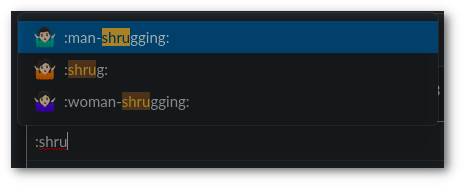
Teams does not autocomplete/search emoji. If you click through the emoji picker, it will show you that the same emoji has a (manshrug) shortcut. But now I've gone through a bunch of mouse interactions to get to that point and I still have to remember that.
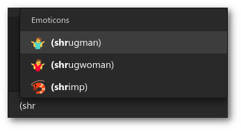
UPDATE (2021-10-05): At some point auto-completion of emoji was added. Since it uses parentheses as the trigger, it does more work than it has to since writing things in parentheses is completely normal (isn't it?) and thus it works harder than it needs to because those are common marks that are used often, but whatever.
It looks like when they added the auto-completion, they also changed the shortcut name. (manshrug) is now (shrugman)
Really sums up my overall view of all of this
Giphy Grid
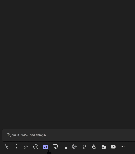
It's a little bit unfair to compare the giphy integrations between Slack and Teams because Slack doesn't actually do it natively, it relies on a bot to be installed. On Teams, the gif previews are comparatively like looking at a postage stamp on the surface of Earth from the upper atmosphere. At the point I get to the images, I'm already agitated that I have to take my hands off the keyboard to move to the mouse, then have to hunt down the "gif" button. I click it and am presented with tiny grid of pictures that I can often not see the text included because they are so small. Using animated gifs in chat is supposed to be fun, and for me the interaction in Teams is just a bit more cumbersome.

A bunch of similar icons. Yes it has a hover text to tell me what they do, but it's not as fast as typing /giphy derp to get an immediate giphy posted.
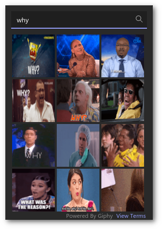
The tiny grid of blurry/shrunk images
Also of annoyance, the images only show some small portion of the loop. So I could do a search for "why", see the Spongebob image and think "that'll do". When I actually send it, I notice that it only showed me the first second of the animation and the rest of it was "don't you go fuck yourself". Ok...that specific example never happened, BUT the fact that I don't actually see the whole animation until I pick it does lend itself to some misunderstandings if there are further frames that don't make sense in the context of the conversation.
While we are on the topic of loops, Teams decides it is best that it only loop a gif 10 times, and then it presents a play button for you to view it again. Why? Animated gifs typically don't have any media controls. Of course that also means if I am in another window it is now up to me to hit the play button to see the animated gif someone posted to the chat. This is probably another area that is ripe for a setting to configure how someone wants to interact with gifs. Personally, I am of the opinion that an animated gif should just keep looping until it scrolls of the screen and I can no longer see it.
The steps required to pick the first image in Teams is something like 'Take hand off keyboard -> Move mouse to gif button -> Click gif button -> type search term -> find tiny image that looks like it might work -> Click image'. Now I'm at a message with an image in it, I still haven't sent anything. Now is the point where I will see something inappropriate with the image and have to start the process over again. Compared to Slack which is 'type /giphy search term -> tab/shift tab + space/enter to shuffle or send (optionally Take hand of keyboard -> use the mouse to hit send or shuffle buttons)'.

Much more visible image (though you do have to shuffle to see more than one, and if you shuffle past the one you want, that's annoying too)
Useless Previews
In slack, when you paste a URL, it will intelligently generate a preview. Which means when you paste a link to an image, it will expand to show the image.
A nice rendering of the image when all I did was paste the URL to that image in the chat
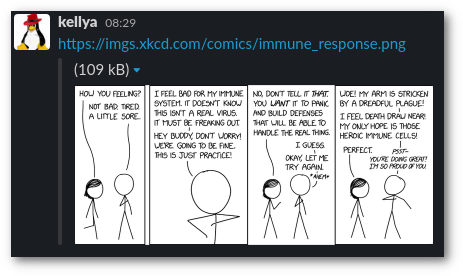
In Teams, the experience is...well...different. It shows the image, but it has a giant window obscuring the image with the URL of the image which you can already plainly see in the text portion of the message. To add to the pointlessness, the URL in that overlay is truncated. So what was the point? I can't see the image preview OR the URL. The whole thing makes it completely useless.
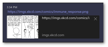
WTF is this!?
The second image gets worse the more you look at it. Notice that not only did it overlay the completely pointless URL over top of the image, it cropped the image horizontally also. The first pane you see in the comic in the Teams preview is the second panel in the comic. It chopped the preview and then stuck a useless URL (since it is already displayed, in its entirety, in the text) over the preview making the preview completely useless.
Also, if you think "Well can't you just click that [X] to make the stupid overlay go away?". No. That removes the preview altogether. Which technically might be an improvement compared to this abomination of a preview.
It also seems to be pretty random when it displays this totally broken-ass preview. Most of the time when I paste a link to an image, it just stays a link and never gets a preview. Which, as mentioned, is probably an improvement over this shit show.
Recent Activity
This should really be called "Interactions or mentions since the last time I was annoyed by it and cleaned them out", because that's what it is. There is no way to control the list, so any time you get an update for any chat you are in, any time someone @mentions you, or you miss a call, all of that goes in this list. You can manually "hide" them but you have to personally cull them.
EDIT: It seems since my initial complaint on this the behavior has changed. You now no longer can clear the notifications. All you can do is Mark them read/unread. It appears that it now shows a rotating list of things up to a month old. I'm OK with this. I would still kind of rather there be a control that I could set it to a week if I chose, but not having to manually manage it is definitely an improvement.
Files
File sharing in Teams is quite frustrating. That is because there are many locations that a file could be shared. You can attach it to a team space, a group chat, an individual chat, or a meeting. The "Files" button in the left-hand navigation takes you to files you most recently opened, but there is no list of files that were recently shared to you. So if you forgot that you were in a meeting when your colleague shared that file (and didn't share it to you directly) it is actually pretty difficult to find it.
If you opened a file, it will at least show up in recents, but if someone shared a file in a meeting for you to review later, it is a scavenger hunt to figure out where it was left.
Presence
I know Windows people who have told me this isn't a problem for them, so perhaps this is just a Linux thing (or maybe even specifically a me thing). In my case, my desktop Teams instance is always the preferred presence. What I mean is, if I have Teams running on my desktop, I will not get notifications to my phone when new notifications come in. They will wait until I get back to my computer and (maybe) see them.
(Update 2021-08-11) Something changed here that has made it even worse. It is notifying me everywhere. That means when I am actively typing in a chat and getting new notifications, my chat client and also my watch are presenting notifications. I now miss the days where it only went to my desktop because this is extremely annoying.
App Integration
I have integrated exactly two external services with Teams and it was a gigantic pain in the ass to set that up. The way authentication and API access is handled in general involves so many more hoops to jump through. Take a look at any bot-type thing that offers both Teams integration and Slack integration. Look at the details for what it takes to install the same thing between the two platforms. The Slack side will be something like "Add the app to your workspace, allow it to post in your channel, done". On the teams side you have many more steps to get it to install in the first place.
As an example, check out the documentation for Mio.
To install Mio on Slack, it's essentially one click and then you get '/mio' commands to interact with it
For Mio on Teams, There are a lot more steps. That isn't even including the amorphous "onboarding process" that isn't covered in that document.
Webhook annoyance (2021-07-21)
As mentioned above, I have a service integrated with a webhook to a channel in a team. I never use it because it is far easier to get that information from Matrix or Slack, Teams is more inconvenient for me. I was going through cleaning out old notifications, and I see this "connection expired" warning instead of notifications from my integration.
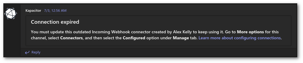
Webhook URLs expire?
So I follow the navigation referenced in the text, and eventually see:
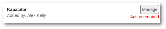
Action required
And I click on [manage] and get:
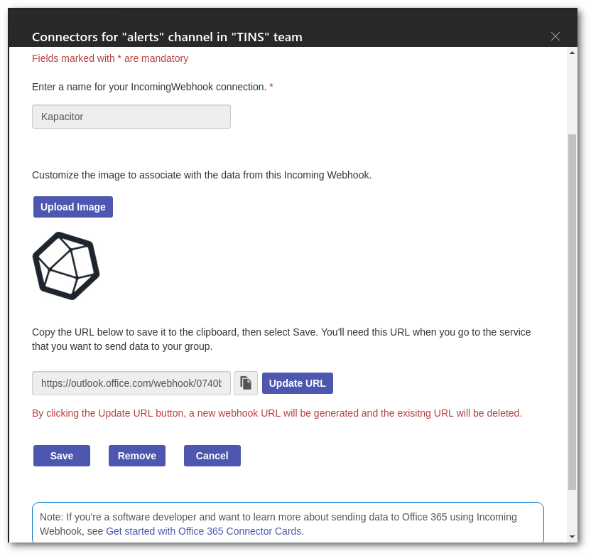
What am I supposed to update?
On this page, the "copy URL" button just turns into the "🚫" cursor. If I try to use the "Update URL" button, it doesn't appear to do anything. And then if I click save, I get a "something went wrong :(" message. All completely useless.
I had to delete the webhook, generate a new one, and then change anywhere the old URL referenced to the new one. It looks like they initially (stupidly) had everyone in a global outlook.office365.com/webook URL scheme, and they changed it to "<yourtenantid>.webhook.office.com/webhook2". Overall that is probably a better URL scheme, but obviously changing the endpoints is annoying for anyone who has to change their configurations everywhere because they figured out too late that their original scheme didn't scale well. Luckily I only had 2 configured.
Client integrations
Teams is a proprietary chat platform (technically-speaking so is Slack). As such, if you don't want to use their client, you are stuck. There are no choices. You either use their client or you don't chat on their platform. Open protocols (like IRC, XMPP, or Matrix) are better in this respect. If you don't like some crappy thing the client does, just use another client. That's not the case with Teams.
Using Matrix and looking into bridging options, I discovered very quickly that there is an integration for most any other chat platform. Just look at the list of bridges available. Even proprietary crap-fests like Facebook have a bridge, but there is nothing for Teams. This doesn't necessarily mean that it is just too proprietary and can't be integrated with another client. It could just mean there hasn't been enough interest for someone to spend the time on it. After all, Mio, referenced above, did get their Universal chat integrated with Teams, so on some level it's potentially possible.
This section isn't specifically a hard fault of Teams. And certainly "Does it have a matrix bridge" is not really a valid metric to determine the worthiness of a chat platform. I do think it reflects on the overall workability of the platform though. This is just based on personal experience with integrating a bot with Teams and extrapolating that experience to the assumption that is why there aren't more integration options with Teams.
Desktop Updates
First of all, I am happy that there is an actual RPM package, and not an .appImage. While appImages are easy to make a cross-platform package, I definitely appreciate having a native .rpm file that is updatable via my system package manager. Since there are web assets embedded in the Electron app, there are updates that happen outside of the package manager. It is never clear what changes have been applied, and there is no changelog to reference (at least not within the app). Occasionally I see this ambiguous "You've got the latest updates. Enjoy", with no clue as to what changed. Going through the app to the "Check updates" menu tells me to get updates through my system package manager.

UPDATE 2022-09-05: According to a Hacker News update, they are discontinuing the Linux client. I can't say I'm exactly surprised. They hardly updated it, and didn't add any of the other (mostly shitty) features. I am likely stuck with either using someone else's electron-wrapped app, or using the web version. The annoying thing about the web version is that I am going to have to use Chrome (or possibly even Edge) to get all the things to work.
Video chat issues (2021-07-30)
I have modified this document many times since I initially wrote it. I have shied away from complaining about the video chat because every single video chat software I have used has been slightly-less-than-optimal. Using Teams more while working from home, there are some things that I just have to get off my chest now.

IOS App-Specific issues
Missed Calls Notification
One of the most annoying things on any mobile app is a notification that won't go away. The "missed calls" notification is one that tricks me all the time. The problem is, the "Calls" button is hidden under a "More..." button with nothing on the app screen hinting that there is a notification in an area that isn't visible. You just have to know to check that area and clear out anything in there.
UPDATE (2021-07-21): The IOS version has been updated to include a number badge over the "more" menu. So now you at least get a hint that there are notifications hiding under there.
Swipe menu is pointless
In Slack, the swipe-right menu allows you to quickly bounce between various communities of which you are a member. It is (in my opinion) a really good use of the menu. In teams you set your status message, settings, and availability. Essentially it is a waste of a panel (for me anyway) because I never set those things. Personally I would rather all those things that are hidden under the "more" button be on that panel, and everything in that panel be under the more button that I will never need to use.
Reading history in an active chat is impossible
I don't use the IOS app all that often. Recently there was an issue that prevented me from logging in on the desktop and I was on the mobile app. There was an active chat going on, but I had missed the beginning of it. So, I scrolled to the top of the chat to read what I missed. And every time a new message came in, the view jumped all over the place and snapped down to the new message. And I tried to scroll back up, and a new message came in and snapped me back down. This seems like an actual bug, but that is also a very basic chat interaction that should not be that broken in a version 2.x product.
Notifications number by chat
If there is 1 new message in "general" chat, the app notification will show 1. If there is a new message in that chat, the app notification will still say 1. If there are 30 new messages in general, and one in "secret chats", the notification will now show 2, because two chats have updates.
If I have notifications from system monitoring going to a channel, for example, I would prefer to know that 30 things are in an alarm state with my notification badge reflecting that there are 30 new messages to deal with.
I'm honestly a little mixed on this. For the example given, I would prefer to have the individual messages count. Element chat for IOS does the same thing on Matrix. In that case, I am in a bunch of random public chats and don't particularly want to know that there are 300 new messages in #fedora because someone touched a nerve complaining about Silverblue. In that case, I mute notifications for noisy channels that I don't care about the number of messages, I'll get to it when I get to it.
Overall it would just be better if there were a notification badge setting to say "Number of chats or Number of Messages" as the badge.
Speed Dial
2022-07-13 If you were to look for a speed dial setting, where would you put it? Maybe a button on the keypad? Maybe a stand-alone button (like chat and calls) that you could quickly get to? There are a couple of choices. Where does the teams IOS app put it? Under the calls button? And it does it with this weird toggle button to change the interface between speed dial and history (which don't really seem to relate to each other, so I'm not sure why they are two sides of a single toggle.
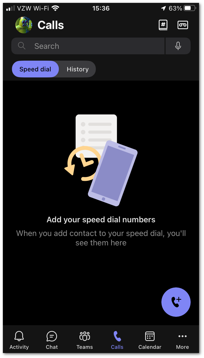
Speed dial/calls screen
Of course "speed dial" is prioritized, because it's not particularly "speedy" if you have to click through a few levels before you get to the actual speed dial entries (although many buried pointless clicks are all over this crapplication anyway). While the interface is weird to begin with, this is exacerbated by the fact that I am constantly having to go into history to hopefully get a notification to clear and now I have one more navigation point to get to the thing I am looking for. I am sure it wasn't always like this. I don't know if this was a feature that changed, or if the behavior changed when my office phone became a Teams number.
App store Changelog
'Bug fixes and performance improvements' That's the perpetual update for almost every single update. This is not a problem unique to Teams, but it is frustrating when you go through the effort of clicking through to see what changed to know what to look for, and instead get "some stuff was updated". Gee, thanks.
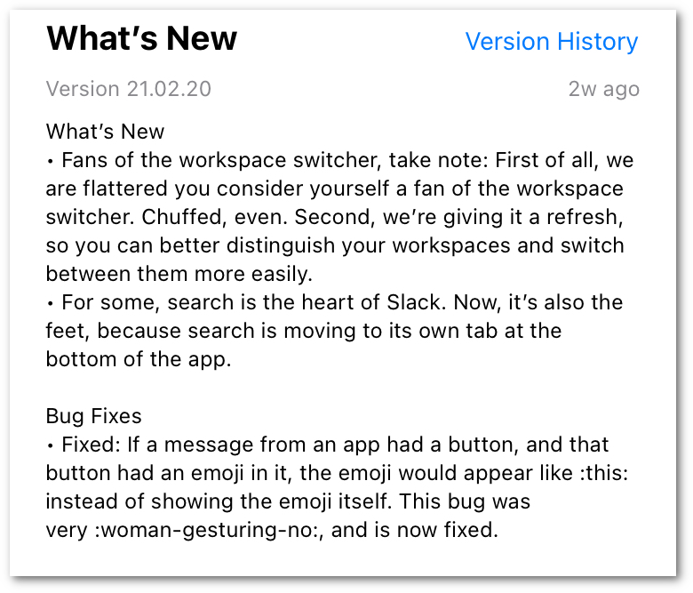
Slack, on the other hand, always has explicit changes presented in an often comical way that makes it informative and entertaining. I'm not saying everyone has to do it that way, but a little more information would be be nice. What performance was under-performing that was fixed? What bugs were fixed. Some basic info would be nice.
Calls (2022-04-27)
We have recently begun adding our work phones to Teams. I had previously been using a softphone, so the overall concept is fine, and I suppose it's arguably nice to have it all in one app: It sure would be nice if that app wasn't teams though.
Notifications that won't go away
I have previously complained about this problem in the mobile app. On that side, it was a case of not seeing where the notification was coming from, and they did minimally address that problem. In the desktop app, it is plain to see the red dot on the calls. Although I don't have a screenshot of it currently, each new entry in the calls log also shows a red dot beside the new ones. You click the message, and red dot on that entry goes away. Pretty typical stuff except...

Red dot indicator burning a hole in my soul
Clearing out all the new notifications on the calls does not immediately remove that red dot on the overall "Calls" category. Sometimes you have to click off of that category to force it to refresh. Sometimes no amount of clicking will make it go away. It will (probably) eventually go away, but there is always some amount of long delay from when you mark the messages to the category actually clearing the indicator.
Forwarding
Call forwarding is a very common thing people want to do with their phones, and Teams phone does allow forwarding. It also let's you set up call groups and define how you want to ring the group (all at once, one after the other). I haven't used the call group stuff, but that looks like it might be useful.
This is the most annoying part. Teams treats all calls as teams calls. So there is no differentiation from someone dialing my desk phone or someone actually calling me from the teams app. This means it doesn't intelligently disable video when the person on the other end could not possibly do a video call. For my particular desired setup where I forward to my cell phone, that means anyone who is trying to a do a face-to-face meeting via Teams will get forwarded to my cell phone and it will just be a regular voice call. They won't see any difference though and will wonder why I don't have my camera on. This means my normal preference to have all calls forward to my cell phone is impossible because it breaks all the rest of teams functionality.
Notifications
There is no settings for presence, or seemingly any awareness of presence at all. If I'm in a meeting, Teams should know that. There is no way to silence calls when in a meeting, or when marked busy. If you are in a meeting, you will still get the notification (on your phone via the app, and via the desktop toaster notification) with the annoying ringtone and probably have to ask the remote side to repeat whatever they said because the stupid call came in over them asking something.
This is kind of a new problem since before if I were physically in a conference room for a meeting, unless I was forwarding calls, I would never have known my desk phone was ringing in another room. The work from home stuff has forced this convergence, but this tool isn't smart enough to "get with the times".
Jumpy Transcriptions
This is just a weird UI thing. For some reason when you mouse-over the voicemail transcription text, it re-flows the text. I have no idea what is going on here, and it isn't earth shattering, it's just annoying.
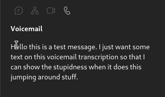
Here, I'll make this dance for no reason
IOS Notifications
This is technically more of an IOS app specific thing, but I'm putting it here with the rest of the calls complaints. The teams app does not handle notifications preferences correctly at all. I have notifications set to mirror on my watch. Teams calls always ring my phone and no notification is ever sent to my watch. This is annoying since it doesn't follow the logic of everything else that is set and just kind of does its own thing.
Ringtones
This is definitely a personal preference, but I find most of the default ringtones (and most of the notification sounds in Teams) to be horrible. It's like they start with an OK simple notification sound that would be fine on its own, and then overlay this horrible "whoop" sound that is just out of sync from the rest of the sample to be annoying and it ends up just sounding like shit to me. I know this is something that isn't even remotely quantifiable, and is completely subjective, I just don't find any of the default sounds appealing. I guess it does have the positive benefit of me dealing with a call quickly so I can stop it from making that horrible sound :)
Answering Calls
(2022-06-08) Today while researching a weird caller-id issue (which actually turned out to not be an issue with teams) I was presented with a new annoyance. A teammate made a teams voice call to my voice number. The call rang to my phone via the teams app, and also to my desktop. I answered the call on my desktop. My phone continued to ring. It continued to show the "incoming call" screen on my phone even after the call was finished. I had to swipe to answer it, even though there was no call to connect, to make the screen go away. I don't know if this is the iOS app being flaky, or if it is because teams isn't tracking this information correctly at the server side so that the iOS client never got an update the the call was already handled. I also don't answer many voice calls, so this will be difficult for me to figure out the actual culprit :)
Summary
Wow, you made it to the end? Well thanks for reading my rant about MS Teams. Some of this may come off as me just being salty because I'm not a fan of MS stuff, and am just "mad" that I'm being made to use Teams professionally. If I thought teams was actually better, I would like to think I would admit that I was mistaken. Some of the things I've outlined above are admittedly a little nit-picky. One of the biggest things is that it is billed as a chat application. To me, the layout and interaction within a chat demonstrates that it really isn't a chat first app. It is more like a universal entry point to all things office 365 with chat as a basically-functional afterthought.